
The brief and the pressure
IremboApp was a zero-to-one project with an aggressive timeline: concept to working prototype in days, full V1 launch within a month.
The challenge was never just the schedule. It was the question underneath it:
How do you design public services that don't feel like the government? How do you start small but design for scale? How do you make something so simple that anyone who uses WhatsApp can use it?
The problem
Rwanda had made significant progress digitising government services, but the experience was fragmented. Getting a birth certificate, renewing vehicle insurance each lived in different places, different websites, different apps, different queues.
For urban, tech-literate users, this was friction. For most Rwandan citizens, mobile-first, often low-bandwidth, frequently first-time digital users it was a barrier. The deeper issue wasn't that services were unavailable. It was that the experience of using them was designed for a user who didn't exist: desktop-first, highly literate, unbothered by complexity.
My reference point was my mum. She sends WhatsApp messages effortlessly, no help needed. But she calls me when she has to make a digital payment. Why?
That question shaped everything.
I was the lead and for most of V1, the only designer on this project.
Step 1 Learn from what already works
Before sketching a single screen, we audited the most-used apps in Rwanda: WhatsApp, TikTok, Facebook. Not for inspiration but for habits. What makes TikTok feel effortless? Why does WhatsApp require no tutorial? What interaction patterns have millions of Rwandan users already internalised?
We then studied how global super apps started: Gojek, Careem, Grab. Specifically: which core services built trust first, and how did they layer complexity without overwhelming users?
Step 2 Reject the first idea
The first prototype was a chatbot. It felt smart, conversational, low-friction. It failed almost immediately. What works in casual chat doesn't translate to structured forms. Filling in government certificate details through a chat interface created more confusion than it solved.
We pivoted fast. That failure clarified our core principle: one main action per screen. Language simple enough for a student and a farmer. Layouts that echo apps people already use.
Step 3 Start small, deliberately
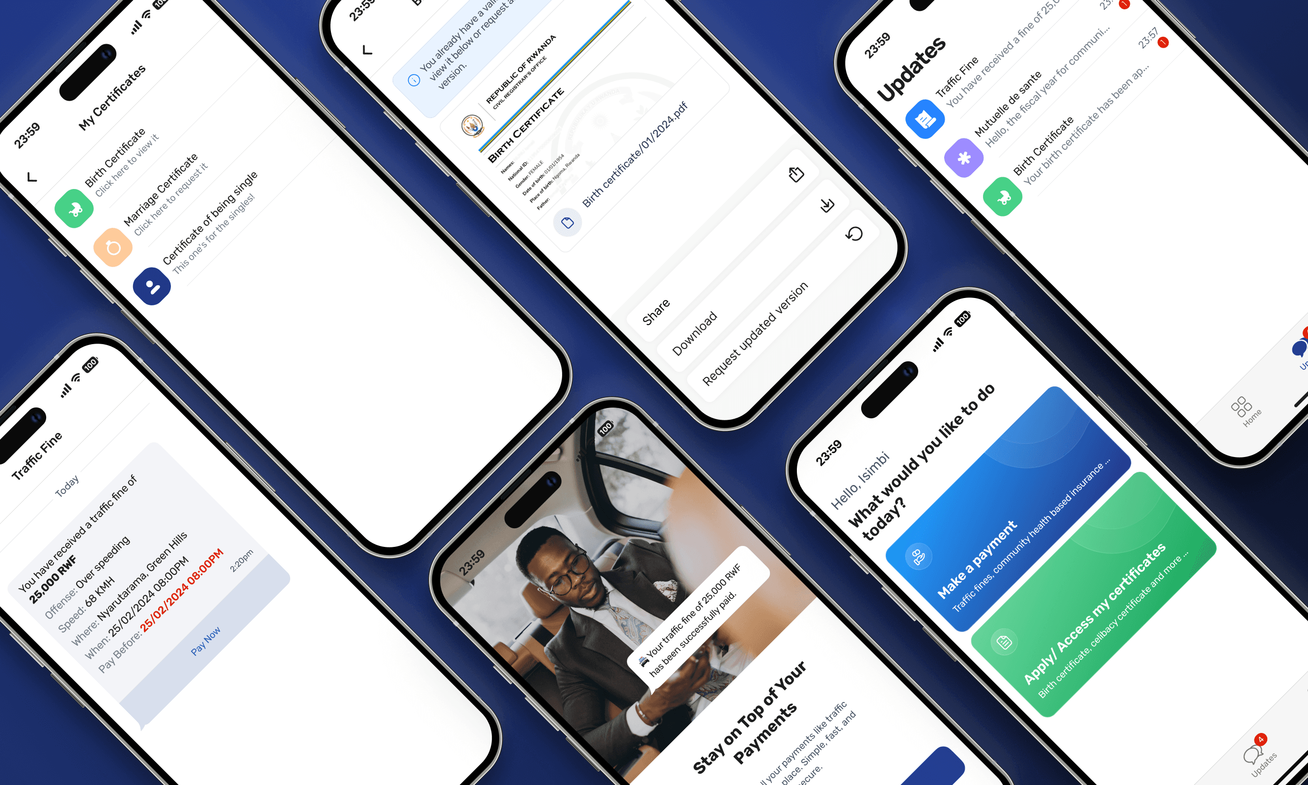
We launched with the five most-used government services: birth certificates, celibacy certificates, marriage certificates, Mutuelle (community health insurance), and traffic fines.
Each was redesigned around a specific friction point:
Certificates: now stored in the app, protected by the phone's own PIN, fingerprint, or Face ID. No more printing, no more losing paperwork.
Mutuelle payments: users save their MoMo or Airtel Money number once. No retyping on every visit.
Traffic fines: the moment a fine is issued, the app sends an in-app notification with full details. One tap to pay. No late fees from not knowing.
These weren't just convenience improvements. They were designed to make the app feel essential before it was comprehensive.